

Last Updated on December 12, 2023
A color palette is like roller coaster tracks. It guides your decor on a journey of twists and turns. It keeps it going in the right direction and holds it in place. Your decor does not need to be boring when you stick to a color palette. In fact, it gives you the freedom to select the decor that fits you and your family perfectly.
Without a color palette, decision fatigue can take over every time you select a new item. Making a color palette takes a few minutes and will save you time and money as you decorate your living room.
Check out this color wheel that’s under $10. It’s the perfect tool for selecting a color palette. It’s helpful to have in front of you as we work through the following steps.
Here’s how to choose a color palette for your living room:
- Select the number of colors you want to work with (between 3-8)
- Find a starting point (based on existing colors, furniture, etc…)
- Decide on your contrast and tone
- Select dominant colors
- Make a mood board
Select the Number of Colors
The number of colors you select will help determine the style of your living room. Using more colors often leads to an eclectic style, while fewer colors can result in a minimal or traditional style.
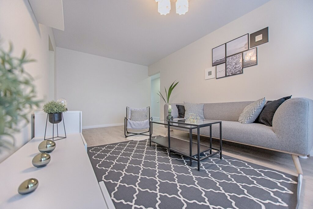
Minimal Living Room Color Palette
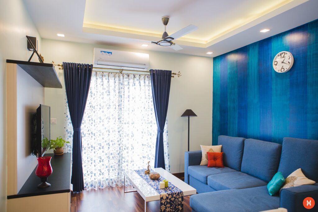
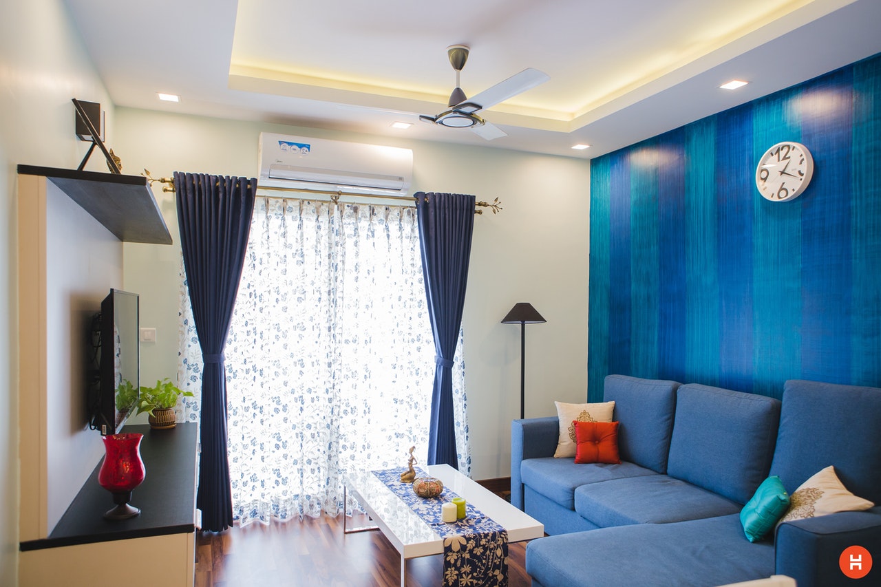
More Eclectic Color Palette
Regardless of style, it’s important to select 3-8 colors for your living room color palette. Remember that a color palette is not just for paint. Your color palette will include the textiles, wood and metal in your living room.
Find a Starting Point
There are a few ways to begin when deciding on a color palette.
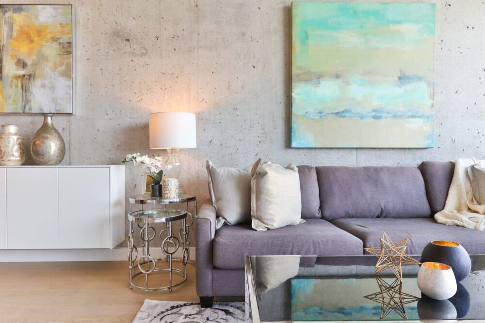
Start with a rug or piece of art
One of my favorite ways to formulate a color palette is by using my favorite artwork. Artists are experts at color palettes. They can make colors feel whimsical or bold, modern or traditional, minimalist or maximalist. Take some time to look for art or a
Here are some of my favorite places to find art and rugs:
- Amazon
- Etsy
- Antique Malls
- Estate Sales
- Festivals and Markets
Start with existing colors
Another way to select a color palette is to observe the colors that are currently dominant in your home. Walk through your home and make a list of the colors you see throughout the home. Consider colors that are on walls, furniture, flooring and curtains. If you find some repeat colors, that’s a great starting point for your color palette.
Not every color in your home needs to make it into your living room color palette. Make sure to stay within the limit of 3-8 colors. To refresh the palette, choose a few current colors and add a few new colors.
Start with your favorite color
It’s your living room! Make it your favorite colors. I’ll never forget the joy I experienced when I painted my bedroom lavender as an eleven year old.
My favorite colors have changed over the years, but every room in my house incorporates at least one of my favorite colors. For a more sophisticated look, try muted versions of your favorite colors.
Start with nature
Just like artists, nature knows how to do color palettes.
There are color palettes galore in nature! Consider the bright color palette of the rainforest, the moody blues and greens of the ocean, or the earth tones of the desert. Each setting presents a different color palette. Decor companies often design products based on these color palettes, making the decor process a breeze.
Decide on Contrast and Tone
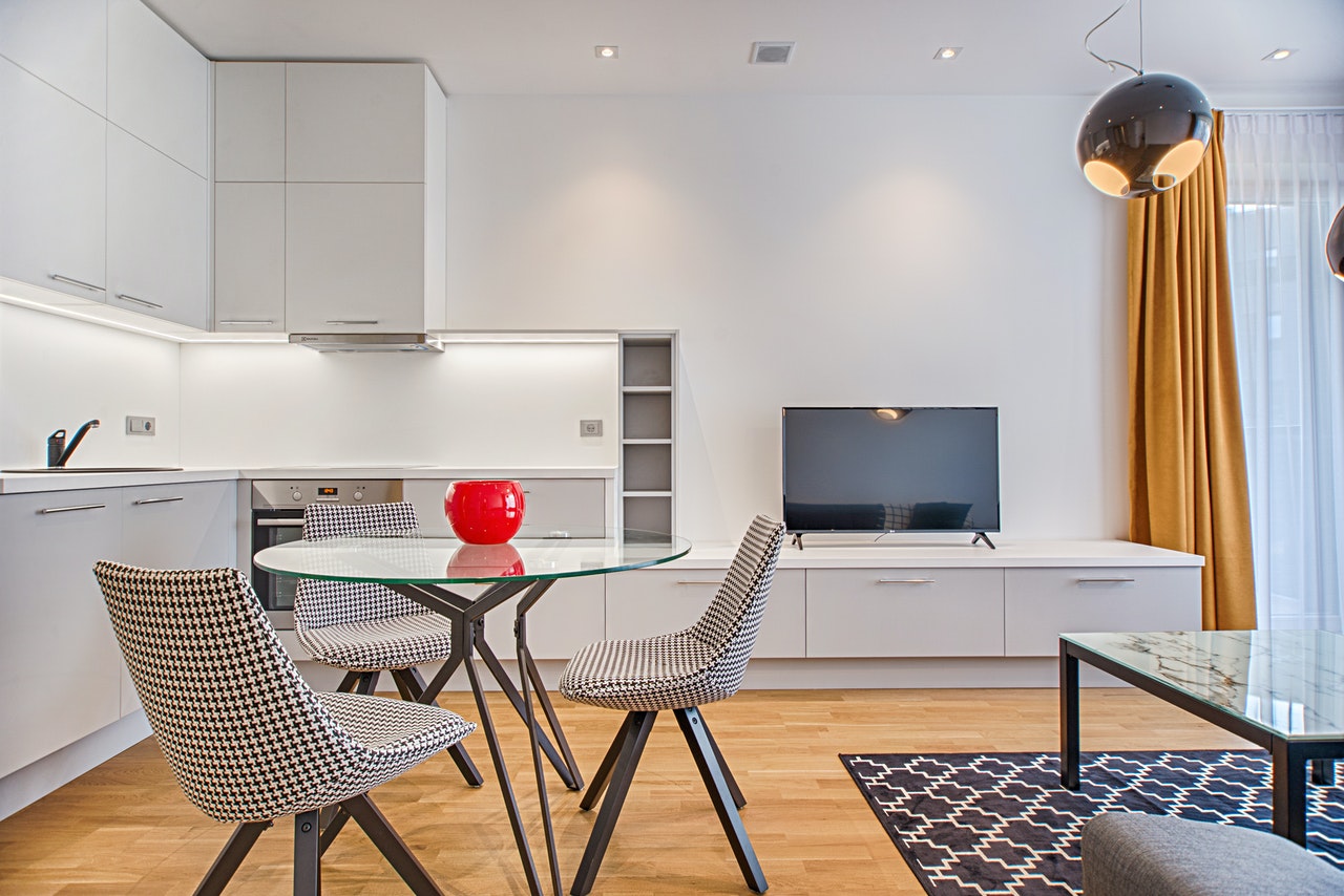
You can select colors that contrast each other: Think black, white and red.
Or, you can select colors that are tone on tone: Think beige, ivory and white.
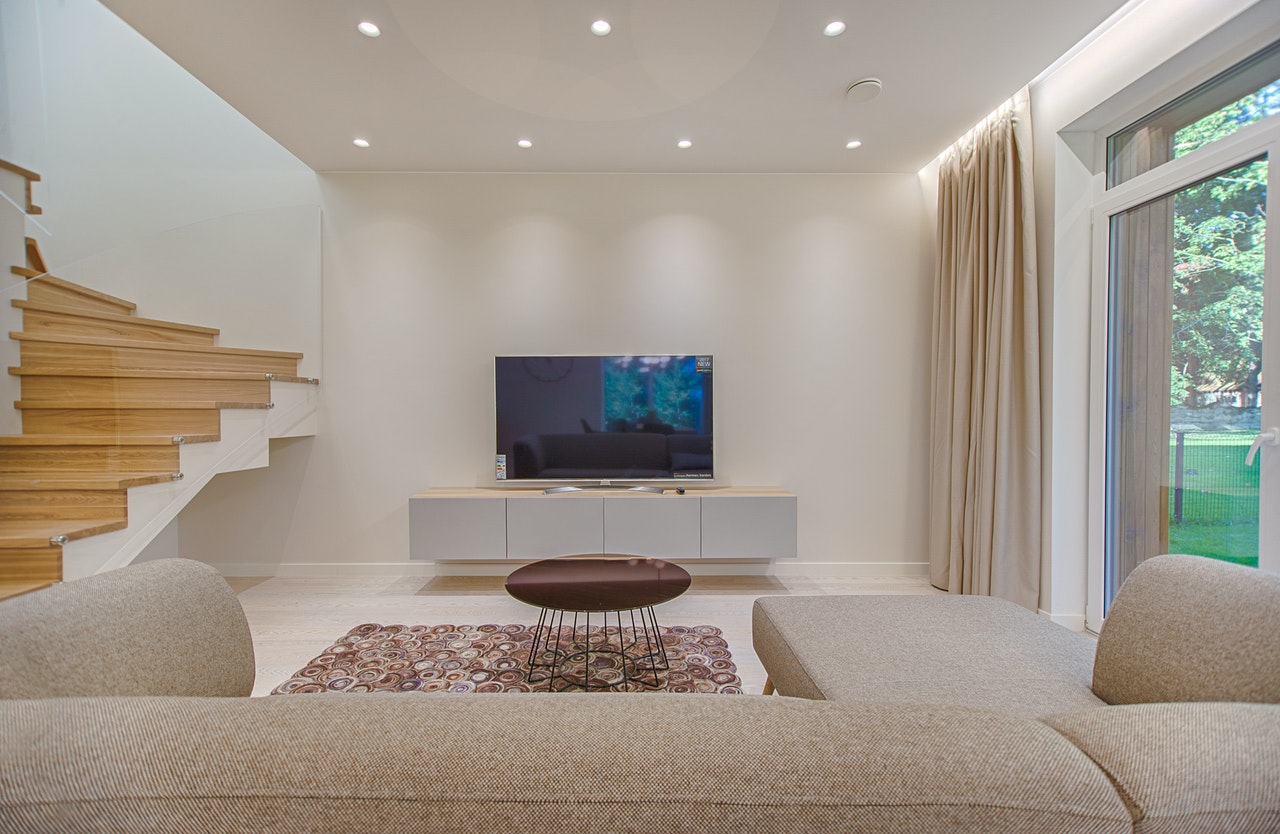
Make a list of the colors you have in your palette. Then, put them into a search engine or into Pinterest, along with “living room.”
Examine the search engine photos for color contrast. Notice if there are other colors included in those palettes that contribute to the high contrast or tone on tone look. You may want to use this new inspiration to switch out a color to better match the level of contrast in your palette.
Select Dominant Colors
Once you choose the colors in your color palette, identify which colors will be dominant.
Having 1-2 colors that repeat frequently throughout your living room, elevates the design. Even if you are going for an eclectic or maximalist look, make one of the dominant colors neutral or grounding to pull everything together.
Here are a some of my favorite colors to ground a room:
- White
- Beige
- Grey
- Black
Make a Mood Board with your Color Palette
When you have your colors selected, and you know the frequency with which they will appear, create a mood board! Don’t begin decorating your living room without one.
You can make a mood board with:
- Canva
- Throwing photos into a Word or Google Doc
- Make a physical mood board
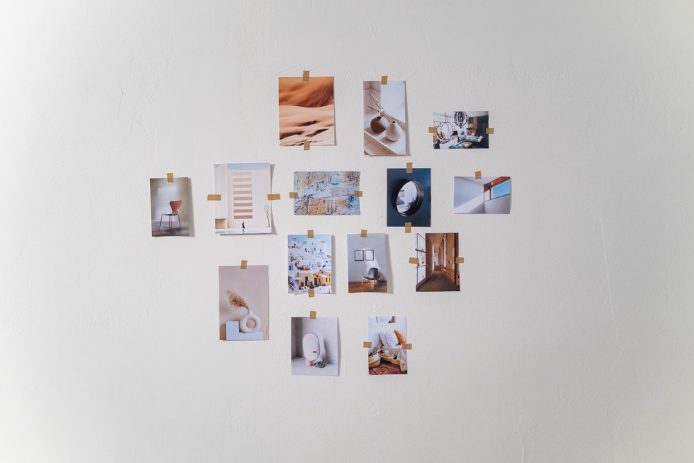
To make a physical mood board, get some fabric samples, paint samples, wood samples and any other samples you need. Put them all together on a poster board, bulletin board or in a tray. Not only will this be a satisfying reward for finalizing a color palette, it will serve as a guide as you decorate your living room.
If you realize the colors in the palette aren’t working well together, don’t start over. Simply switch out one color at a time and you’ll quickly find a solution.
Deciding on a color palette for your living room is a challenging task. However, once you have a color palette selected, the decisions that follow will not be riddled with indecision. You’ll be confident as you stroll or scroll through endless decor options. The final product will be a beautifully colored living room that reflects your style!